
Other Submissions
#showyourstripes
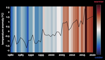
The Arctic is warming more than twice as fast as nearly everywhere else on the planet
A depiction of the famous warming stripes (coined by Ed Hawkins) for temperatures in the Arctic region. Each stripe represents the average temperature of each year relative to the average temperature over the entire period. This value is known as the temperature anomaly. Blue shades represent years that are colder than average, and red shades represent warmer-than-average years. The stark trend of deepening red toward the right indicates that there is a clear warming trend in the Arctic over time. This trend of increasing temperature can also be seen in the black line overlaid on the stripes. The Arctic is warming more than twice as fast as nearly everywhere else on the planet. This is causing sea ice to melt at alarming rates, which has many implications for changes in climate on the global scale.
Data: Air temperature data are from the Japanese 55-year Reanalysis product.
References: Hawkins, E. Show Your Stripes. 2018-2019. https://showyourstripes.info/.
Lauren Hoffman is a graduate student associated with the Scripps Institution of Oceanography at UC San Diego.

"Building Cell Structure" by Charlotte (Curtis) Marquez
Using a groundbreaking new technique we can now build a human cell like a “3D puzzle” from scratch
Cells are like 3D puzzles, we know how they should look globally and how two puzzle pieces (e.g. proteins) connect locally, but we lack information of the intricate internal structure. In “A multi-scale map of cell structure fusing protein images and interactions” (Yue Qin, et al. Nature 2021), scientists demonstrate a groundbreaking AI approach in silico that enables scientists to build this “3D puzzle” from scratch. This innovative new approach to mapping cell structure combines microscopy, biochemistry and artificial intelligence to reveal previously unknown cell components. Here we see MuSIC interpreted as a 3D puzzle being assembled by a cohort of scientists.
Charlotte Marquez is a scientist associated with the UC San Diego School of Medicine, Ideker Lab.
Contributors: Trey Ideker and Yue Qin

"Decoding Cell Structure" by Yue Qin
Using a groundbreaking new technique we can now decode human cell structure directly from data
In “A multi-scale map of cell structure fusing protein images and interactions” (Yue Qin, et al. Nature 2021), scientists demonstrate a groundbreaking AI approach in silico to decode the convoluted human cell structure directly from data. This innovative new approach to mapping cell structure combines microscopy, biochemistry and artificial intelligence to reveal previously unknown cell components. Here we see MuSIC interpreted as binary streams of data raining down to form the structure of a cell.
Yue Qin is a graduate student associated with the associated with the UC San Diego School of Medicine, Ideker Lab.
Contributors: Charlotte (Curtis) Marquez and Trey Ideker
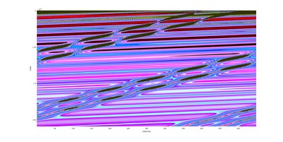
"Good Vibes" by Ian Frankel
Interaction of linear and nonlinear waves in a lattice with equal constraints and degrees of freedom
This project studies how nonlinearity influences the response of zero energy modes of deformation in a topological lattice with balanced degrees of freedom and constraints. These topological lattices can be tuned to have a soft edge with zero stiffness and a hard edge with infinite stiffness. In addition the quasi-static nature of the zero modes in two spatial dimensions can be shown to mimic nonlinear wave phenomena in one space and one time dimension. This study demonstrates how nonlinear waves add a new degree of deformation and energy manipulation in addition to previous topological band theory allowing for novel metamaterials and a new and efficient method for studying nonlinear dynamic systems.
Ian Frankel is a graduate student associated with the Department of Mechanical and Aerospace Engineering at UC San Diego, Boechler Research Group Wave Material Interaction Lab.
Contributors: Kai Qian, Haning Xiu, Harry Liu, Zi Chen, Xiaoming Mao, and Nicholas Boechler
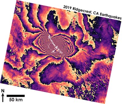
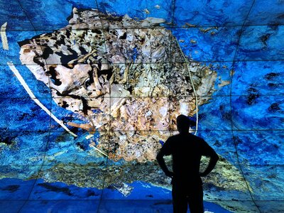
"Rings of the Ridgecrest Earthquakes" by Katherine Guns
Satellite-based radar imaging captures surface change caused by earthquake motion in eastern California
When earthquakes happen, they not only cause ground shaking, but they also cause changes in the shape of the surface of the Earth. We can measure these changes in a number of ways, but one way to see the changes in broad scope, in high spatial resolution, is to look from above, using satellite-based Synthetic Aperture Radar (SAR) data.
What we see here is two Sentinel-1 mission satellite radar images that were taken before and after the July 2019 Ridgecrest, CA earthquake sequence that have been interfered, or differenced, to highlight how the surface has changed between the two collection dates. Each rainbow of color, varying from black to pale yellow indicates 28 mm of surface change. The bullseye at the center of the image indicates the locations of the M6.4 and M7.1 earthquakes, and the higher number of “rainbows”, the more surface change that occurred. In white, we plot the locations of surface ruptures, where the localized earthquake energy caused permanent breaks and faults to open at ground level.
These kinds of images help us understand the extent of earthquake deformation in a regional context, and allow us to better quantify future earthquake hazards for the area.
Katherine Guns is a postdoctoral research associated with the Institute of Geophysics and Planetary Physics at UC San Diego, Scripps Institution of Oceanography, Sandwell Lab.
Contributors: Xiaohua Xu and David Sandwell
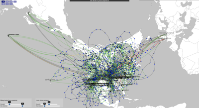
"Spaghetti monster" by Dmitry Mishin
National network routing for 200 nodes forming a kubernetes cluster
The Pacific Research Platform is managing a global kubernetes cluster containing more than 200 nodes in US and other countries. The image shows the network connections between these nodes, including all intermediate network routers. Black points are geolocated nodes, and blue dots are routers. The length of graph edges shows delay - the time it takes a bit of information to travel this path. The large groups of blue dots represent large regional networks with tight connectivity. The edge color shows the throughput of this segment (how fast we can send data through it).
Dmitry Mishin is a researcher associated with the Pacific Research Platform / California Institute for Telecommunications and Information Technology (Calit2).
Contributor: John Graham
"Taking a virtual dive into the Ice Age" by Dominique Rissolo
A researcher takes a ‘virtual dive’ into a cache of Ice Age bones in 3D
Deep below the jungles of Mexico's Yucatan Peninsula is a flooded cave containing the bones of extinct megafauna and the skeletal remains of one of the earliest humans yet discovered in the Americas. It is remarkable place where many archaeologists and paleontologist may never venture. Working with technical cave divers, Qualcomm Institute researchers and their Mexican colleagues have led a major digital documentation effort -- creating a digital twin of the site that can be explored and studied at full scale and in 3D. The WAVE (or Wide-Angle Virtual Environment) at UC San Diego enables researchers to immerse themselves in data collected from such remote and inaccessible worlds.
Dominique Rissolo is a researcher associated with the Qualcomm Institute's Cultural Heritage Engineering Initiative (CHEI) at UC San Diego.
Contributor: Emilio Rissolo
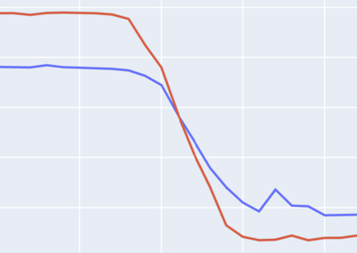
"When a Machine 'Learns'" by Cyril Gorlla
An algorithm inspired by biological neuronal structure learns how to predict unseen human behavior
The point at which the seemingly innocuous red line crosses under the blue represents something magnificent—an artificial neural network performing better on data consisting of unseen human behavior than the data it was trained on. This indicates that the algorithm has truly "learned" the underlying behavior patterns of the people in the data. The simplistic beauty in these two unassuming lines was the product of a research collaboration between the Halıcıoğlu Data Science Institute and Intel, wherein our team sought to predict PC user behavior in order to preemptively load applications. By preloading applications a user would likely use, we were able to improve overall system fluidity, which is especially important for those without access to newer, higher end PC hardware. This image shows the performance of a LSTM model, a neural network based on a structure of connected memory blocks. Over the course of a day, this model was able to predict the duration a user would use a given app within 45 seconds. The blue line indicates the model's performance on training data, while the red line indicates its performance on unseen data (where lower values indicate a more accurate model).
Cyril Gorlla is an undergraduate student associated with the Halıcıoğlu Data Science Institute at UC San Diego.
Contributors: Jared Thach and Hiroki Hoshida
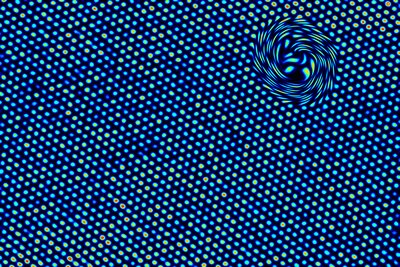
"Whirled Gold" by Jesse Jokerst
This arrangement of gold atoms calls us to look deeper
This is a high-resolution transmission electron microscope image of a gold nanorod. The dots represent individual gold atoms that were assembled to create this material.
Jesse Jokerst is a researcher associated with the Department of NanoEngineering at UC San Diego.